it's about time i sat down and actually started an ongoing blog and not just wait until i have work to put on. so today seem as good as any to start.
after recieveing my grades from my first year of uni im hoping a blog will help me improve my rather dismall D i got for journalism. Luckily the course has been changed now, and journalism is now fashion journalism. I continue to convince myself it was not a waste of a year writing about car accidents and Bob Geldof but merely a learning of the basics, i think of it as a stepping stone.
my next project is to write a short written and visual journalistic fashion piece about the Graduate Fashion Show at the Lawrence Batley Theatre, Huddersfield.
i am therefore researching a list of fashion journalists.
At the moment Laura Craik for The London Evening Standard and Grazia and Cathy Horyn for The New York Times are my favourites, they are such flowing reads and really set the scene. Although liz jones is a refreshing she seems to have humour and throws in personal opinions.
i will be back when i have chosen a favourite, as i have to base it on writing style and their reputation.
Thursday, 18 June 2009
Tuesday, 28 April 2009
changed creative brief
For project 5 where i was asked to restyle an unsuccessful ad campaign i created a creative breif to go along with the project. I really liked the creative breif i made for Clinique and have decided to redo my previous Creative breif for project 2.
As the Ted Baker logo is a rectangle box i decided to put it along the top acting as a title, i wanted it large and bold, but wanted to keep it simple with it being black and white.
I then created the text using text boxes and roatating them to fit well and flow. I much prefere this design for creative breif, but it is simple, readable but doesnt put you off from reading it.

As the Ted Baker logo is a rectangle box i decided to put it along the top acting as a title, i wanted it large and bold, but wanted to keep it simple with it being black and white.
I then created the text using text boxes and roatating them to fit well and flow. I much prefere this design for creative breif, but it is simple, readable but doesnt put you off from reading it.

Friday, 10 April 2009
Final Kolocraft and Design Foundry leaflet

This is one side of my leaflet opened out.
I got the idea of the colour blocks from my research and from the Kolorcraft bar code logo. The blocks are squares filled in, in inDesign. I decided to do them in the colours of the Kolorcraft logo. I really like the way this turned out. i think it links well with the companies and brightens up the leaflet without distracting attention.
i wanted to keep all the Kolorcraft information on one side so it flowed well.
I made the flowchart by using shapes from word.

This is the other side of my leaflet. Because Design foundry doesn't have as much information i kept this all in one box. I thought it was also important to keep other information such as environment issues which relate to both companies in one box.
I got the information for the leaflet off both companies websites and edited it to suit the leaflet and so that it was relevant.
the colour grey used as the background colour on the leaflet i got from the Kolorcraft website. I already has the idea of using the colour grey, so that it would show the bright colours, but then i noticed the Kolorcraft website used it. I opened this on photoshop and used the eyedropper tool to get the exact colour.
I am really happy with the way the leaflet has turned out.
I think it fits in well with the brief as it is a good size, which can be folded up to be used on the move, but also contains all relevant information about the both companies and is bright and eye catching.
Wednesday, 8 April 2009
Leaflet layout ideas
this is some research i did on packaging and leaflet layouts.
For my leaflet i want something that is easy to fold up and take away to use on the move, therefore i wasn't looking for anything to complicated.

i like this layout, it would be an A4 page, landscape and folded in half. i like the use of the block colours as each block could hold different information on both Kolocraft and the Design Foundry.


i really like these leaflet ideas of folding it up a few times into a small square/rectangle, as i think this makes it easier to carry around as well as being able to fit as much information in as i need.
i have made prototypes of the three leaflet layout ideas and where information will be on them.


This is a fold up leaflet where i have created to front to be like an envelope. However i don't really like this because the envelope front doesn't stay down and i don't want to use stickers or have to make a slit to tuck it into to stay down. i like how it is portrait because it will help the flow chart be easily read, flowing down the page.


This is the A4 leaflet prototype however i don't like this because i think it is too big to be taken away and accessed on the move.
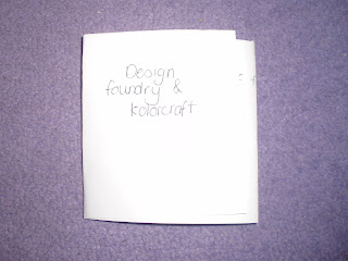

This is my favourite leaflet layout. i like how small it is which was one of my main priorities. It is a good layout to present all the information.
For my leaflet i want something that is easy to fold up and take away to use on the move, therefore i wasn't looking for anything to complicated.

i like this layout, it would be an A4 page, landscape and folded in half. i like the use of the block colours as each block could hold different information on both Kolocraft and the Design Foundry.


i really like these leaflet ideas of folding it up a few times into a small square/rectangle, as i think this makes it easier to carry around as well as being able to fit as much information in as i need.
i have made prototypes of the three leaflet layout ideas and where information will be on them.


This is a fold up leaflet where i have created to front to be like an envelope. However i don't really like this because the envelope front doesn't stay down and i don't want to use stickers or have to make a slit to tuck it into to stay down. i like how it is portrait because it will help the flow chart be easily read, flowing down the page.


This is the A4 leaflet prototype however i don't like this because i think it is too big to be taken away and accessed on the move.


This is my favourite leaflet layout. i like how small it is which was one of my main priorities. It is a good layout to present all the information.
Tuesday, 7 April 2009
leaflet ideas
To start developing ideas for my own leaflet design i did reserach into various brochure and graphic books to gain inspiration.
The best of Brochure design
Young graphic designers Americas published by daab 2008
Because the Kolocraft logo is very colourful, i was looking for inspriation to use colour in innovative eye-catching ways and what colours work well together.

i really like the square block colours used here, and how the number 50 is written within them.

This is my favourite use of colours together. Because the Kolocraft logo is a colourful barcode this is alike this using colours in lines next to eachother. i like the idea of using these block squares or lines of colour as a border on my leaflet.


I like how these images show colour overlapping and how it can work with text. i could use this kind of text for the small titles within my leaflet, such as ' The design and print process' 'how to find us' and 'contact details'.
I either want my leaflet colour to be black, white or a light grey as i think these colours show bright bold colours off well and help draw attention to them.
The best of Brochure design
Young graphic designers Americas published by daab 2008
Because the Kolocraft logo is very colourful, i was looking for inspriation to use colour in innovative eye-catching ways and what colours work well together.

i really like the square block colours used here, and how the number 50 is written within them.

This is my favourite use of colours together. Because the Kolocraft logo is a colourful barcode this is alike this using colours in lines next to eachother. i like the idea of using these block squares or lines of colour as a border on my leaflet.


I like how these images show colour overlapping and how it can work with text. i could use this kind of text for the small titles within my leaflet, such as ' The design and print process' 'how to find us' and 'contact details'.
I either want my leaflet colour to be black, white or a light grey as i think these colours show bright bold colours off well and help draw attention to them.
Kolocraft and the printing process

Partnering the biggest brands in the high street
From fashion to finance, home improvement to food retailing. For more than 25 years we’ve worked alongside some of the most famous and successful names in high street and out-of-town retailing. With annual turnover in excess of £20 million, we’re one of the largest POP producers in the UK.
Clients include big names in electrical retailing as well as the DIY market. Not to mention some of the most well respected brands in cosmetics, automotive, and shopping malls.
They are a very innovative company who strive to produce the highest quality customer service and products to suit the customers needs.
They run at a very fast pace and are able to turn around any project in the tightest of deadlines.
Print Process
Incoming Artwork ; Artwork is received and sorted out.
Scanning and re-production; The scanning operator carries out image re-touching. The image is scanned into the computer and the image quality is checked. e.g. Photoshoots selling clothes will send a piece of material of the clothing so that the operator is able to correctly colour match it in photoshop. The operator is given a brief from the client, this will show the areas of the photograph they want photoshop editing and why e.g airbrushing.
Design department; The mac operator colour separates and paginates to the design brief. Acrobat is used to prevent files being corrupted. When printing there is a colour bar at the top to ensure colours are at the correct density. Guillotine marks are added on the image for when it is to be trimmed. All text is individually checked to make sure everything is exactly correct.The image is sent off the to the client to be approved.
CTP - Computer to plate; this is for litho printing. Everything is checked and re-checked to ensure the file e.g font is not corrupted. The computer shows each separate colour and how they are built together.
- a plate is chosen. They are able to print 25-50 plates an hour. The plates are made of aluminium.
- this goes into a drum at 1000 revolution a minute
- can print 1300 an hour
- the image is put onto the plate
- a plate is used for each colour.
- it is a simple process
- can be printed on a range of paper, self adhesive, plastic and matte.
- the process is one of the full printing processes which is used as an art form as well as commercially.
Lithographic PrintingWorks on the principle that water and oil do not mix.
Lithography is only on one flat surface.
- A plate is treated in a way so that the image areas attract the oil based inks and the non image wet areas repel the oil based inks.
- the plates are wrapped around a cylinder for each separate colour and the paper passes through.
Screen printing Everything is checked from the computer. The image is blown up in digital projection which is not very good quality. This is a printing technique that uses woven mesh to support an ink blocking stencil.
- the screen, made out of Purus, finely woven fabric; mesh is stretched over a frame of aluminum. Areas are blocked off with non-permable material to form a stencil. The images are made up of dots.
- the screens are then dried by UV lights
- they can do around 400 per hour.
- the images come out dry.
- this process can use rigid materials up to 30 millimeters, wood
paper/ cardboard
plastic
glass
The screens are then washed.
Colours are checked on the lightbox and a densitomitor is used to check the ink density.
Cutting department
Digital Department Used in everybody printers, straight from computer to print. Can print 2 to 100. it is not a waterproof process but images can get laminated.
Packaging Department
Recycling is very important to them, following the ISO 1401 environmental standard.
Green bin - recyclable
yellow bin - general waste
red bin- hazardous waste.
Design Foundry

http://www.thedesignfoundry.co.uk/
'We specialise in producing effective in-store communications for some of the biggest names in UK retailing. B&Q, Comet, New Look: these are just some of the major high street brands that rely on our skills to successfully communicate their message. As well as add real value to their brand.
Our team includes strategic planners and creative thinkers. This ensures that every job is on brief, every solution outside the box. Experienced account managers and skilled installation experts guarantee the seamless development of every project from concept to delivery. Whether it´s in-store POS, brand identity and management, or design for print or web'
There biggest client is Comet. And using David Dickinson was a huge promotion, Celebrity endorsement helps when trying to sell a product.They have received a gold medal for innovation for 3D and a silver medal in merchandising. 90% of their work is in store based with about 50/50 of it being both 2D and 3D and about 10% being for brochures etc.
As a team they can have 700 different briefs, but a usual weekly turn around ranges from 100-500 per week.Ideas are usually created by each person then later come together in group discussion and development teams.
A main priority for them when developing ideas is thinking of the most cost effective way of using materials.
When an idea is being developed it will be tested repeatedly.
Subscribe to:
Posts (Atom)