 To begin with my editing the magazine article i have kept the first two pages the same however if i was to create the article again i would swap them around, with the title on the left hand side and Rei Kawakubo and her work on the other, as this makes more sense as the reader reads from left to right. i had to slightly edit the side of the right hand image on photoshop as it wasnt very clear from being scanned in, i did this using the dodge and burn tools.
The next page of the article is facing an advert. The article page is half images and half writing. I have broken the page up and will insert the images and text seperatly. 

This is the article on indesign where the image and text are completly seperate. However there is an image i have had to cut off. This is because i will need this to be a seperate image to allow me to wrap the text aorund it, just like in the original magazine article.I have also begun to experiment with different font styles and trying to fit all the text on the page in a suitable way which i think differs slightly and improves the orginal article.
Here you can see where i have added in the seperate image and wrapped the text around it.
Bewteen the imges there is a gap, where a line of text runs straight across the page in larger font. To do this i created another box and wrote in the line of text and wrapped the rest of the article around this.

After experimenting with different fonts to see how they looked and how the text fitted on the page, i decided on a final one which is i think the most alike to the actual article. i also found a text font which for the text cutting through the page which is very similiar to the article's one, as i think this works well to cut across the page, through the article. it looks seperate but also as part of the article. the text font i used for the quote i also used for the large 'I' which starts the article, this is so that it all links in well together.
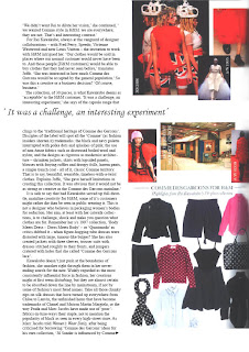
Following, is the next page of the article this is also a single page facing an advert. i have kept the placing of the images the same for two reasons;

1. the quote cuts through the images of Rei Kawakubo's past work and i didnt want to move the quote further down or the H&M clothing up otherwise it would have cut through the Clothing, and i didnt want to break up the image of the clothes.
2. Where the H&M clothing images are placed is next the part in text where the interviewer is talking about her range for H&M so it makes it easier for the reader to look straight across at the clothing range.
The only problem i have on this page is that the quote that runs across the page is slightly too big and when printed out the last letters get cut off. therefore i will experiment with lowering the size of the font, although i still want the quote in large to stand out. i will also experiment with changing the quote for another line in the article.

In the next image you can see i have change the quote. although i do not like this as it it is not long enough and does not run all the way across the page and stand out like i want it to. therefore i will experiment again with different lines or changing the font size.
The final image is the last page of the article. I have moved the image from the botton left hand corner to the top right hand corner, to grab more attention, and i feel it fits in well above the quote. i also brought the image right to the top of the page to carry on the theme of varied margins throughout the article.
 in well above the quote. i also brought the image right to the top of the page to carry on the theme of varied margins throughout the article.
Problems i occur on this page is that the quote doesn't quite cut right across the page, which i will look at changing. there is also a blank space at the bottom of the article. this is because of the slight change in font and size as it has moved all the text further up the article, i will find a suitable image to fill the blank space and look at moving the page layout around again.
No comments:
Post a Comment