
Overall i am happy with the first 3 pages of the article which i have managed to recreate and change slightly.
However on the last two pages of the article i have occurred some problems. the first being the choice of quotes on both pages and the use of font style and text. i had the problem where the quote on both the pages was wither too long across the page when printed out, or the quote did not run all the way across the page and make such a big impact as i had wanted. therefore i experimented with a different quote on the 4th page, however this was much too short. I have then decided to keep the original quote bu take out a word, i have changed the quote from ' she was interested in how much Comme des Garcons would be accepted' to 'she was interested in how Comme des Garcons would be accepted'. i feel this is an appropriate word to take out, as it does not change what the quote is overall saying.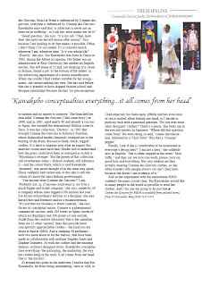

Following onto the next page i again looked at this quote. the original quote ' Kawakubo conceptualises everything...she is the nucleus' didn't quite run all the way across the entire page as i had wanted. i therefore looked through the text that was on this page to try to find a more suitable quote. Nothing quite worked. i therefore decided to keep half of the quote and change the second half. i was able to do this because the original quote had been taken from a small paragraph within the text. by changing the quote to ' Kawakubo conceptualises everything...it all comes from her head' this allowed the text to run across the entire page more so.
i had considered adding another image also onto this page because i have been left with a blank area at the end of the article. The blank space is due to moving the text further up the page on the left hand side and a different font from the original magazine article. I thought about adding another image to the page because after looking through various other ELLE magazines i noticed it is very rare there are large blank space like this one. However i then look at this article and noticed how all the margins around the text are varied and that this seemed to be a common theme for this particular article. I decided then, that adding another image would be too much on one page and also there are already enough images throughout the article. As i am able to edit the article in whatever way i want i decided to leave the blank space at the end of the article to finalise it, and differ it from the original.
Over all i am pleased with the completion of the magazine article i have edited. I have overcome many problems and made various decisions regarding the layout of the article. As this is my first time using InDesign i feel i have learnt a lot about the programme and am able to use it well now.
 To begin with my editing the magazine article i have kept the first two pages the same however if i was to create the article again i would swap them around, with the title on the left hand side and Rei Kawakubo and her work on the other, as this makes more sense as the reader reads from left to right. i had to slightly edit the side of the right hand image on photoshop as it wasnt very clear from being scanned in, i did this using the dodge and burn tools.


