Friday 19 December 2008

completing magazine editing


Overall i am happy with the first 3 pages of the article which i have managed to recreate and change slightly.

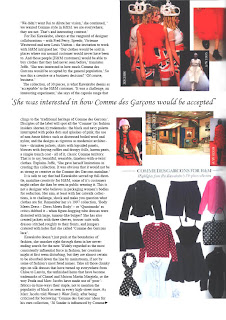
However on the last two pages of the article i have occurred some problems. the first being the choice of quotes on both pages and the use of font style and text. i had the problem where the quote on both the pages was wither too long across the page when printed out, or the quote did not run all the way across the page and make such a big impact as i had wanted. therefore i experimented with a different quote on the 4th page, however this was much too short. I have then decided to keep the original quote bu take out a word, i have changed the quote from ' she was interested in how much Comme des Garcons would be accepted' to 'she was interested in how Comme des Garcons would be accepted'. i feel this is an appropriate word to take out, as it does not change what the quote is overall saying.
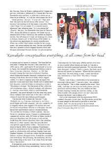
Following onto the next page i again looked at this quote. the original quote ' Kawakubo conceptualises everything...she is the nucleus' didn't quite run all the way across the entire page as i had wanted. i therefore looked through the text that was on this page to try to find a more suitable quote. Nothing quite worked. i therefore decided to keep half of the quote and change the second half. i was able to do this because the original quote had been taken from a small paragraph within the text. by changing the quote to ' Kawakubo conceptualises everything...it all comes from her head' this allowed the text to run across the entire page more so.
i had considered adding another image also onto this page because i have been left with a blank area at the end of the article. The blank space is due to moving the text further up the page on the left hand side and a different font from the original magazine article. I thought about adding another image to the page because after looking through various other ELLE magazines i noticed it is very rare there are large blank space like this one. However i then look at this article and noticed how all the margins around the text are varied and that this seemed to be a common theme for this particular article. I decided then, that adding another image would be too much on one page and also there are already enough images throughout the article. As i am able to edit the article in whatever way i want i decided to leave the blank space at the end of the article to finalise it, and differ it from the original.
Over all i am pleased with the completion of the magazine article i have edited. I have overcome many problems and made various decisions regarding the layout of the article. As this is my first time using InDesign i feel i have learnt a lot about the programme and am able to use it well now.


Tuesday 16 December 2008

magazine editing continued


To begin with my editing the magazine article i have kept the first two pages the same however if i was to create the article again i would swap them around, with the title on the left hand side and Rei Kawakubo and her work on the other, as this makes more sense as the reader reads from left to right. i had to slightly edit the side of the right hand image on photoshop as it wasnt very clear from being scanned in, i did this using the dodge and burn tools.


The next page of the article is facing an advert. The article page is half images and half writing. I have broken the page up and will insert the images and text seperatly.


This is the article on indesign where the image and text are completly seperate. However there is an image i have had to cut off. This is because i will need this to be a seperate image to allow me to wrap the text aorund it, just like in the original magazine article.I have also begun to experiment with different font styles and trying to fit all the text on the page in a suitable way which i think differs slightly and improves the orginal article.


Here you can see where i have added in the seperate image and wrapped the text around it.


Bewteen the imges there is a gap, where a line of text runs straight across the page in larger font. To do this i created another box and wrote in the line of text and wrapped the rest of the article around this.


After experimenting with different fonts to see how they looked and how the text fitted on the page, i decided on a final one which is i think the most alike to the actual article. i also found a text font which for the text cutting through the page which is very similiar to the article's one, as i think this works well to cut across the page, through the article. it looks seperate but also as part of the article. the text font i used for the quote i also used for the large 'I' which starts the article, this is so that it all links in well together.


Following, is the next page of the article this is also a single page facing an advert. i have kept the placing of the images the same for two reasons;


1. the quote cuts through the images of Rei Kawakubo's past work and i didnt want to move the quote further down or the H&M clothing up otherwise it would have cut through the Clothing, and i didnt want to break up the image of the clothes.


2. Where the H&M clothing images are placed is next the part in text where the interviewer is talking about her range for H&M so it makes it easier for the reader to look straight across at the clothing range.


The only problem i have on this page is that the quote that runs across the page is slightly too big and when printed out the last letters get cut off. therefore i will experiment with lowering the size of the font, although i still want the quote in large to stand out. i will also experiment with changing the quote for another line in the article.


In the next image you can see i have change the quote. although i do not like this as it it is not long enough and does not run all the way across the page and stand out like i want it to. therefore i will experiment again with different lines or changing the font size.


The final image is the last page of the article. I have moved the image from the botton left hand corner to the top right hand corner, to grab more attention, and i feel it fits in well above the quote. i also brought the image right to the top of the page to carry on the theme of varied margins throughout the article.
Problems i occur on this page is that the quote doesn't quite cut right across the page, which i will look at changing. there is also a blank space at the bottom of the article. this is because of the slight change in font and size as it has moved all the text further up the article, i will find a suitable image to fill the blank space and look at moving the page layout around again.


Wednesday 26 November 2008

editing a magazine layout.


For project 1 in IT and advertising production i was asked to choose an article from a magazine that attracts and interests me, to scan it in and using adobe indesign i had to re-style and re-structure the article acording to how i think it should be layed out. i am able to change the article as much or as little as i want to.


The article i have chosen to be re-presented is from the November 2008 issue of Elle. It is an article called 'Comme des Garcons hits the high street', where one of Elle interviews the mastermind behind the designer label, Rei Kawakubo about her collaboration with H&M and her work overall.

These are the images of the original scanned in article;

The beginning two page spread to the article i think should be the opposite way round, because readers tend to read from the left to the right, therefore the image of Comme des Garcon and her work can be easily bypassed.


The next two images are from the next two double spread images, next to these pages are adverts from O2 and John Lewis. i really like these pages because they seem to follow a colour theme each. i don't think they need editing much, however i would like to experiment with a different font for the 'I' and the quotes which go across the page.


The final page of the article is mainly writing. however i like how the quote runs straight the way through to break it up, also the images are in a good place at the bottom right, as they are easily visible, however the images are not in timeline order, the images are shown are from different years but in a mixed order. i think i will change it so they read from left to right in chronological order.
I like the unique layout of this article and think it works well for being about Rei Kawakubo, therefore i do not want to change the layout too much, only develop a good knowledge of Indesign.


Friday 14 November 2008

a stylist is an interpretor of fashion

The stylist puts together looks according to a brief for a particular look as interpretations of what the editor has ordered or off their own back.

My first out of the class assignment was set for me to be a stylist to a partner in class.
i began with a customer profile. to create a basic outline of my partner's everyday guidelines or 'rules' as i referred to them. everyone has their own set of rules i realised, conscious or sub-conscious...they are there.
Customer profile - Erin Maguire
shops- boutiques/ all saints/primark/dorothy perkins/H&M/ASOS
spent on average monthly - £150
Colours- Black/ grey/corcol/ pink/ coral - unsure about cream/brown/red
fabrics- silk/chiffon/stretch cotton/ stiff fabric
shopping environment- doesnt like the internet/ preferes town centres for independant shops.
favourite designers- all saints/ religion/ arrogant cat/ aqua couture
favourite body features- legs/eyes/lips/smile/ hair
disliked body areas- stomach/ breasts - too big and not in proportion with her body.
style icon- lindsey lohan

my objective was to create 3 outfits for my client, experimenting with new looks and ideas.
* i will add images as soon as i can*

Overall i found being a stylist difficult. Initially i expected to find it quite hard to dress Erin's figure as it is different to my own and have never dressed anyone but myself before, however once i begun it wasn't as hard as i imagined and i began to understand her figure and what suited her. I was nervous to style Erin as she has a strong self found style already therefore i didn't necessarily want to experiment with dramatic new styles but rather open her eyes to different colours and garment fittings. As i begun to look at Erin's style and understand her 'rules' i found it much easier to pick garments out for her. styling Erin opened my eyes to how different people have to think about their different body features and figures. It helped me see that different people like different fabrics also, this task allowed me to see clothes from a new point of view rather than my own personal. working with a client allowed us to discuss a range of stores, designers, clothes and personal views on shopping and clothes in general and i enjoyed swapping opinions and views.