For project 5 where i was asked to restyle an unsuccessful ad campaign i created a creative breif to go along with the project. I really liked the creative breif i made for Clinique and have decided to redo my previous Creative breif for project 2.
As the Ted Baker logo is a rectangle box i decided to put it along the top acting as a title, i wanted it large and bold, but wanted to keep it simple with it being black and white.
I then created the text using text boxes and roatating them to fit well and flow. I much prefere this design for creative breif, but it is simple, readable but doesnt put you off from reading it.
Tuesday, 28 April 2009
Friday, 10 April 2009
Final Kolocraft and Design Foundry leaflet
This is one side of my leaflet opened out.
I got the idea of the colour blocks from my research and from the Kolorcraft bar code logo. The blocks are squares filled in, in inDesign. I decided to do them in the colours of the Kolorcraft logo. I really like the way this turned out. i think it links well with the companies and brightens up the leaflet without distracting attention.
i wanted to keep all the Kolorcraft information on one side so it flowed well.
I made the flowchart by using shapes from word.
This is the other side of my leaflet. Because Design foundry doesn't have as much information i kept this all in one box. I thought it was also important to keep other information such as environment issues which relate to both companies in one box.
I got the information for the leaflet off both companies websites and edited it to suit the leaflet and so that it was relevant.
the colour grey used as the background colour on the leaflet i got from the Kolorcraft website. I already has the idea of using the colour grey, so that it would show the bright colours, but then i noticed the Kolorcraft website used it. I opened this on photoshop and used the eyedropper tool to get the exact colour.
I am really happy with the way the leaflet has turned out.
I think it fits in well with the brief as it is a good size, which can be folded up to be used on the move, but also contains all relevant information about the both companies and is bright and eye catching.
Wednesday, 8 April 2009
Leaflet layout ideas
this is some research i did on packaging and leaflet layouts.
For my leaflet i want something that is easy to fold up and take away to use on the move, therefore i wasn't looking for anything to complicated.
i like this layout, it would be an A4 page, landscape and folded in half. i like the use of the block colours as each block could hold different information on both Kolocraft and the Design Foundry.
i really like these leaflet ideas of folding it up a few times into a small square/rectangle, as i think this makes it easier to carry around as well as being able to fit as much information in as i need.
i have made prototypes of the three leaflet layout ideas and where information will be on them.
This is a fold up leaflet where i have created to front to be like an envelope. However i don't really like this because the envelope front doesn't stay down and i don't want to use stickers or have to make a slit to tuck it into to stay down. i like how it is portrait because it will help the flow chart be easily read, flowing down the page.
This is the A4 leaflet prototype however i don't like this because i think it is too big to be taken away and accessed on the move.
This is my favourite leaflet layout. i like how small it is which was one of my main priorities. It is a good layout to present all the information.
Tuesday, 7 April 2009
leaflet ideas
To start developing ideas for my own leaflet design i did reserach into various brochure and graphic books to gain inspiration.
The best of Brochure design
Young graphic designers Americas published by daab 2008
Because the Kolocraft logo is very colourful, i was looking for inspriation to use colour in innovative eye-catching ways and what colours work well together.
i really like the square block colours used here, and how the number 50 is written within them.
This is my favourite use of colours together. Because the Kolocraft logo is a colourful barcode this is alike this using colours in lines next to eachother. i like the idea of using these block squares or lines of colour as a border on my leaflet.
I like how these images show colour overlapping and how it can work with text. i could use this kind of text for the small titles within my leaflet, such as ' The design and print process' 'how to find us' and 'contact details'.
I either want my leaflet colour to be black, white or a light grey as i think these colours show bright bold colours off well and help draw attention to them.
Kolocraft and the printing process
Partnering the biggest brands in the high street
From fashion to finance, home improvement to food retailing. For more than 25 years we’ve worked alongside some of the most famous and successful names in high street and out-of-town retailing. With annual turnover in excess of £20 million, we’re one of the largest POP producers in the UK.
Clients include big names in electrical retailing as well as the DIY market. Not to mention some of the most well respected brands in cosmetics, automotive, and shopping malls.
They are a very innovative company who strive to produce the highest quality customer service and products to suit the customers needs.
They run at a very fast pace and are able to turn around any project in the tightest of deadlines.
Print Process
Incoming Artwork ; Artwork is received and sorted out.
Scanning and re-production; The scanning operator carries out image re-touching. The image is scanned into the computer and the image quality is checked. e.g. Photoshoots selling clothes will send a piece of material of the clothing so that the operator is able to correctly colour match it in photoshop. The operator is given a brief from the client, this will show the areas of the photograph they want photoshop editing and why e.g airbrushing.
Design department; The mac operator colour separates and paginates to the design brief. Acrobat is used to prevent files being corrupted. When printing there is a colour bar at the top to ensure colours are at the correct density. Guillotine marks are added on the image for when it is to be trimmed. All text is individually checked to make sure everything is exactly correct.The image is sent off the to the client to be approved.
CTP - Computer to plate; this is for litho printing. Everything is checked and re-checked to ensure the file e.g font is not corrupted. The computer shows each separate colour and how they are built together.
- a plate is chosen. They are able to print 25-50 plates an hour. The plates are made of aluminium.
- this goes into a drum at 1000 revolution a minute
- can print 1300 an hour
- the image is put onto the plate
- a plate is used for each colour.
- it is a simple process
- can be printed on a range of paper, self adhesive, plastic and matte.
- the process is one of the full printing processes which is used as an art form as well as commercially.
Lithographic PrintingWorks on the principle that water and oil do not mix.
Lithography is only on one flat surface.
- A plate is treated in a way so that the image areas attract the oil based inks and the non image wet areas repel the oil based inks.
- the plates are wrapped around a cylinder for each separate colour and the paper passes through.
Screen printing Everything is checked from the computer. The image is blown up in digital projection which is not very good quality. This is a printing technique that uses woven mesh to support an ink blocking stencil.
- the screen, made out of Purus, finely woven fabric; mesh is stretched over a frame of aluminum. Areas are blocked off with non-permable material to form a stencil. The images are made up of dots.
- the screens are then dried by UV lights
- they can do around 400 per hour.
- the images come out dry.
- this process can use rigid materials up to 30 millimeters, wood
paper/ cardboard
plastic
glass
The screens are then washed.
Colours are checked on the lightbox and a densitomitor is used to check the ink density.
Cutting department
Digital Department Used in everybody printers, straight from computer to print. Can print 2 to 100. it is not a waterproof process but images can get laminated.
Packaging Department
Recycling is very important to them, following the ISO 1401 environmental standard.
Green bin - recyclable
yellow bin - general waste
red bin- hazardous waste.
Design Foundry
http://www.thedesignfoundry.co.uk/
'We specialise in producing effective in-store communications for some of the biggest names in UK retailing. B&Q, Comet, New Look: these are just some of the major high street brands that rely on our skills to successfully communicate their message. As well as add real value to their brand.
Our team includes strategic planners and creative thinkers. This ensures that every job is on brief, every solution outside the box. Experienced account managers and skilled installation experts guarantee the seamless development of every project from concept to delivery. Whether it´s in-store POS, brand identity and management, or design for print or web'
There biggest client is Comet. And using David Dickinson was a huge promotion, Celebrity endorsement helps when trying to sell a product.They have received a gold medal for innovation for 3D and a silver medal in merchandising. 90% of their work is in store based with about 50/50 of it being both 2D and 3D and about 10% being for brochures etc.
As a team they can have 700 different briefs, but a usual weekly turn around ranges from 100-500 per week.Ideas are usually created by each person then later come together in group discussion and development teams.
A main priority for them when developing ideas is thinking of the most cost effective way of using materials.
When an idea is being developed it will be tested repeatedly.
Design and production visit
The client has invited me on a research visit and it is important for me to gather relevant information to help me communicate back to my 'agency's' creative team.
This is the schedule for the day of the visit, showing each department of the design and printing processes.
Also shown here is the Health and Safety risk assessment sheet.
This is the schedule for the day of the visit, showing each department of the design and printing processes.
Also shown here is the Health and Safety risk assessment sheet.
Project 6- DESIGN FOUNDRY & KOLORCRAFT Promotional Information Leaflet
Design Foundry and Kolorcraft are the clients.
They have commissioned my 'agency' to design and produce an innovative new promotional brand information leaflet.
This leaflet is to be aimed at providing quick and easy offline access to Design Foundry & Kolorcraft information for brand communication to; Customers
Clients
Suppliers
New employees visiting the sites.
The Leaflet must illustrate the stage by stage design - production processes and other key elements of brand information and services at both of the companies.
Project requirements;
The clients have specified the leaflet must have 4 main potential outcomes:
1. Be innovative designed and styled
2. Be functional to carry/ takeaway/ read/ refer to on the move.
3. Clearly and accurately communicate the Design Foundry and the Kolocraft brands.
4. Incorporate a flow chart graphic/ visualisation of the Design Foundry design & Kolorcraft printing production processes.
Monday, 6 April 2009
Final Campaign
This is our final 3 page Clinique campaign.
We edited the cut out bottles by adjusting their colours in colour balance, and using the dodge and burn tool to highlight and darken/ shadow areas to make the bottles look more 3D and live in the picture.
Although the bottles do look quite photoshop-ed on i feel happy with the campaign, i feel we met all our clients and our own aims in what we wanted to create. And created something new, fresh and innovative for both the brand and the magazine. I think the campaign is fun and eyecathcing. This is also the reason we chose to use a more decorative text than we had originally planned on using. We were orginally going to use a plain simple text just like past Clinique ads do however searching through the text fonts we felt this one was appropriate for the ads. It is eye- catching, readable and fun and goes well with the colours. We chose to keep each page simple with just the number. We got this idea from a past Clinique ad for the 3 step system.
This shows simply what we are advertising.
The words 'Splash out' we felt appropriate for the ad. It is catchy because it links to the splatter of colours but is also a phrase used when people purchase something. The first two pages with the words 'Splash out' on would open on a double spread and read across the page, and the clinique would be on the following page.
Because the images we are creating use a messy background we had to think about the way in which we were going to shoot the images.
We want to keep the products looking clean, fresh and simple, as they always so in Clinique adverts. Therefore we need the photography studio to create the correct lighting and background. However the background we want to create is messy and we wouldn't be able to do this in the studio.
Therefore we have decided to shoot the products and the background separately. We have already previously discussed the use of photoshop on our images to give them a more crisp look by editing the lighting and adding text on so i feel confident that this is the right way to go about creating the campaign.
To create the separate background splatter i bought an A2 piece of card and splatted pink food colouring mixed with water onto it.
We took this piece of card into the studio with us when we were shooting our products. We took photographs of both the products and card alone as well as putting them together.
Here you can see the images of just the bottles alone. We shot them on a
small table which had a white sloping back and top so that there are no harsh edges or corners where the top of the table and the back meet. We pulled the large box lights right down above the products so that they were lit from both the front and the back to separate them from the background, and had to shoot from quite far away as we were using a tripod and couldn't get very close to the table, this was OK though as we intend to edit the images on photoshop.
In the top left hand corner you can see where i have cut around the moisturise bottle on photoshop using the magnetic lasso tool so that i can copy this onto the splatter background.
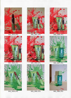
This is the splatter background we have decided to use for all three pages on the campaign. We are just going to change the colour of the splatter using the colour balance tool, crop it and photoshop each product on the different pages.
Final Ideas
In our final consultation meeting the Clinique clients really liked our ideas, but mainly we really excited by the colour splattering images. They thought they were exciting and new for Clinique and linked well to be used in Another Magazine. They thought they were still in keeping with Clinique's clean, simple and fresh image but also were exciting.
Together we discussed how the images would be spread across the various pages, and we came to the conclusion of only having a 3 page campaign instead of a 4 page one. This was because we feel the final page, which would feature all the products which are in the bonus time would be irrelevant for Another Magazine, as the magazine is innovative and different they would not want to preview something so obvious.
This also related even better with the 3 step system Clinique products are based upon. We therefore decided to shoot each page with just one product on.
The clients liked the colours we chose to use and presented the idea of using a different colour for each page.
We decided to use the three primary colours ; RED, YELLOW, BLUE...as this would be simple which is what Clinique want to display the 3 step skin car system as; simple.
Test shots
These are our best test shots developing each idea.
Water
our idea was to pour water over the products and using a fast shutter speed we could capture the moving water and freeze it when it is falling and splashing. These pictures were very time consuming and it was very much a down to chance on capturing the right splash or amount of falling water, therefore the process had to be repeated many times.
We liked the effect of the ripples of water and the splashes that were caught on camera. Capturing the beads of droplets also made the images look quite delicate.
However because these were our test shots we used a clear tray which had some detail on it and put it on a small wooden table, all of which are obviously seen in the photographs, therefore if we were to use this technique for the final photographs we would have to think about how we would photograph it in a suitable environment.
Spring
Petals
The are our best test shots using a flower and it's petals with the products. we like these images because they are simple and very fresh. The colour of the flower is very nice and soft and not too overwhelming, therefore keeps in tune with being romantic but not cheesy.
We would use the petals as a story over the pages, one being either the beginning or end and gradually getting more being added over the pages.
Splatter of colour
After using water over the products and finding we really like the splattering/splash effect on and around the products we decided to experiment with the use of pastel colours on the backgrounds of the image.
We created the colour using food colouring. Food colouring enabled us to get the correct colouring we wanted as we could add water to it to create a more pastel shade.
I really like these images. they are eye catching and different, which was our main aim for advertising in Another magazine. They are bright and colourful as well as being fresh and simple, which is overall in keeping with both the brand and the magazine. The idea of the splatter developing over the pages could include wither the splatter getting larger over the pages or the changing of colour, as we experimented with both green and pink colouring.
Continuing experimenting with the food colouring and splattering we added a slight splatter of green on the red to see what effect this gave us.
I really like these images. Although they are much more grungier and less romantic and pretty than our other images they are very innovative and exciting to look at. The colours are still fresh and do not overwhelm the products.
Makeup
These are our test shots using the make up around the products as the background.
i like the idea of using the powder as the background of the image as i think it is interesting and intriguing for the viewer to look at. However i think these image look tacky and do not sell the products very well.
We created mood boards for each of our ideas to present to the clients so they were able to clearly see how the idea would work and they could then make a decision on which one they wanted to use and how they wanted us to create it.
photographers
Here are some images from photographers which inspired me with my ideas for the Clinique shots.
Solve Sundsbo uses techniques to freeze movement. i really like his images and how they really capture a moment which is really what photography is all about.
The photographer that is helping and advising us on this project is Jacueline Callaghan. I really like the way she uses the human body to create shapes. In this image she told us she how she captured the water from a shower head and froze it and where she positioned the model to create this image. i have found her help very useful.
Our Brief
I have written a brief which i can use for this project of restyling the Clinique brand in Another magazine.
it contains all relevant information about the project objectives, requirements and target audience as well as background information on both the brand and the magazine.
It is pleasing and interesting to the eye as well as being easy to read, follow and understand.
consultation meeting
Our first development consultation meeting went very well.
The meeting allowed us to ask question we were unsure about. For example we were unsure about the use of the valentines theme as we felt it could hold back our ideas if we had to consistently link back to this theme of the valentines theme. We were told to stay away from the valentines theme as they didn't want it to become cheesy.
They told us rather than creating a campaign for the bonus time, instead they want a product launch in Another magazine. This will enable us to be much more creative with our ideas.
When photographing the products they told us to think about how we are going to put the products together ensuring we create a rhythm for the eye.
They want to see test shots to show how we are experimenting with all our different ideas and how the ideas work when put infront of a camera.
The Clinique representatives really liked our ideas and wanted us to choose three main ideas to pick up on and develop to show them next time, enabling them to pick one for us to use as for the final campaign.
ideas, inspiration and research
This is our mood board we created to display our ideas to show how we have thought about both the brand and the magazine.
As we are creating the campaign to re-launch in Another magazine we researched into past issues of the magazine. We found 6 page spreads in the last 2 editions for TIGI hair products, which have been shot using a lot of colour very stylistically. I likes this idea for our campaign.
We have decided we want to create a 4 page spread, incorporating Clinique's 3 step skin care system. So we want 3 focus products from the Bonus Time gift collection in separate pages and then a final page with all the gifts photographed together. On the spread we want to keep it simple yet effective.
We aim to use experimental photography as this is an edgy style press magazine and a highly stylized photography will fit in and interests the audience.
Looking at past Clinique adverts we prefer the adverts from the springtime. (left hand side of mood board) There look is fresher and more eye catching, which is how we want to re-style the campaign. There is an image we found of Clinique products in the grass (bottom left side of mood board) which we really like. It makes the viewer think of spring and look forward to the summer season.
I have also noticed the use of nature in adverts is popular for S/S 09 campaigns, such as Burberry ;
Our aim is we want our target customer to get excited about the coming season and buy something new for it from us.
This coming season we can see pastel colours are a big trend.
And as Clinique products are in pastel shades well feel this is a perfect opportunity to link our products with colour and create something new and interesting for Clinique.
As this is a valentines promotion we want to highlight the romance with a range of themed backgrounds. Rose petals and love hearts sweets are our first ideas. Using pale pink roses, as this links with out pastel and nature theme. We will test both of these ideas.
We really like the idea of frozen imagery used in previous Clinique campaigns. so in the test shots we want to experiment with this. We want the adverts to look fresh, so water will be used to get this effect.
Another idea we want to experiment is the use of the actual make-up products, for example pouring the powder around the products or using lipstick on the background. the idea of using lipstick smudged or writing on the background along with the products is quite romantic and signals love.
Regarding to the text in the ad. We want to completely strip all the text and the idea is to use one simple headline sentence for the first 3 pages, saving the bulk info e.g. Bonus time is on, when it is on and where etc... for the last page. These one line sentences will have a romantic theme, and initial ideas are 'give yourself a sweet treat' 'a gift from us'. Something regarding to the present buying theme for Valentines day.
With the ad being spread over a few pages we also have the idea of a story developing over the 4 pages, tieing in with the romantic themes, for example, 'he loves me, he loves me not', and on each page another petal is taken off a flower.
The Campaign
This is the image of the original campaign we have been asked to re-style.
The Campaign was for Clinique's Valentines day bonus time.
We feel the advertisement looks cluttered and rushed.
We think the lips and the writing 'love & kisses' looks tacky.
Although we do feel it is in keeping with the brands simple clean identity, which we can see is consistently carried through in other Clinique advertisements and campaigns. (below)
Because it is for a promotional seasonal campaign and for Another magazine we feel the campaign needs something more to it, something to catch the customers and reader attention as well as being in keeping with the time of year the campaign is being released.
Subscribe to:
Posts (Atom)