Water

our idea was to pour water over the products and using a fast shutter speed we could capture the moving water and freeze it when it is falling and splashing. These pictures were very time consuming and it was very much a down to chance on capturing the right splash or amount of falling water, therefore the process had to be repeated many times.
We liked the effect of the ripples of water and the splashes that were caught on camera. Capturing the beads of droplets also made the images look quite delicate.
However because these were our test shots we used a clear tray which had some detail on it and put it on a small wooden table, all of which are obviously seen in the photographs, therefore if we were to use this technique for the final photographs we would have to think about how we would photograph it in a suitable environment.
Spring
Petals

The are our best test shots using a flower and it's petals with the products. we like these images because they are simple and very fresh. The colour of the flower is very nice and soft and not too overwhelming, therefore keeps in tune with being romantic but not cheesy.
We would use the petals as a story over the pages, one being either the beginning or end and gradually getting more being added over the pages.
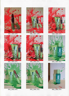
Splatter of colour
After using water over the products and finding we really like the splattering/splash effect on and around the products we decided to experiment with the use of pastel colours on the backgrounds of the image.
We created the colour using food colouring. Food colouring enabled us to get the correct colouring we wanted as we could add water to it to create a more pastel shade.

I really like these images. they are eye catching and different, which was our main aim for advertising in Another magazine. They are bright and colourful as well as being fresh and simple, which is overall in keeping with both the brand and the magazine. The idea of the splatter developing over the pages could include wither the splatter getting larger over the pages or the changing of colour, as we experimented with both green and pink colouring.
Continuing experimenting with the food colouring and splattering we added a slight splatter of green on the red to see what effect this gave us.

I really like these images. Although they are much more grungier and less romantic and pretty than our other images they are very innovative and exciting to look at. The colours are still fresh and do not overwhelm the products.
Makeup
These are our test shots using the make up around the products as the background.

i like the idea of using the powder as the background of the image as i think it is interesting and intriguing for the viewer to look at. However i think these image look tacky and do not sell the products very well.
We created mood boards for each of our ideas to present to the clients so they were able to clearly see how the idea would work and they could then make a decision on which one they wanted to use and how they wanted us to create it.
No comments:
Post a Comment